Key Takeaways
- A plain tray body plus a single embossed logo is often the most efficient way to brand ice, because it concentrates the design effort on one detail instead of spreading it across the whole tray. Custom silicone ice cube projects typically allow cavity, shape, size, color, logo, and packaging changes [K1].
- The direction of the mark matters: a raised logo inside the mold cavity produces a recessed mark on the cube, while an engraved logo produces a raised mark. Buyers should confirm the intended direction in writing during design review.
- Most practical value comes from early decisions — logo placement, stroke weight, tray format, and color contrast — rather than from adding more decoration later.
- Verified silicone specifications for Renjia's silicone product lines include food-grade material, odorless properties, and temperature resistance from -40°C to 240°C (-40°F to 464°F), with custom colors, sizes, shapes, and packaging available [K5].
- A successful project is usually run as a sequence: design review → tooling → sampling → approval → production and inspection, with MOQ and lead time confirmed at quotation stage [K2].
1. Introduction
Branded ice is one of the cheapest forms of brand exposure in hospitality, beverage retail, and promotional gifting — and one of the easiest to get wrong. Buyers often start with an ambitious idea: a sculpted cube, a multi-part tray, a full-coverage printed pattern. Then they discover the practical costs: complex tooling, longer sampling cycles, higher unit prices, and logo details that vanish once the tray is filled with water and frozen.
That is why a minimal approach keeps winning. A plain silicone ice tray embossed logo strategy — a clean tray body, one clear brand mark, controlled color, and packaging that carries the rest of the message — gives buyers most of the branding benefit with far fewer manufacturing risks. It also aligns well with how custom silicone ice cube molds are actually developed: the design file is reviewed, tooling is prepared, samples are produced and approved, and then production runs [K1][K2].
This article explains how the plain-plus-logo approach works in practice. It covers the design logic, the difference between embossed and debossed logo marks, material and compliance considerations, and a step-by-step process buyers can follow from concept to shipment. It is written for brand owners, promotional product buyers, hospitality suppliers, and sourcing teams who want a defensible decision rather than a decorative one.
2. Why Minimal Tray Design Produces Stronger Branded Ice
Core conclusion: design effort should be concentrated where users actually look — the cube surface — instead of spread across the entire tray.
When a tray is heavily shaped or decorated, the visual attention splits. The tray looks busy, but the ice itself may show only faint, fragmented shapes. A plain tray with one well-placed mark works the other way: the tray stays easy to stack, easy to clean, and easy to photograph for product listings, while the logo is the single focal point on the finished cube.
The practical reasoning
- Tooling is simpler. A plain body with a localized logo detail keeps the cavity geometry straightforward, which usually means fewer tooling revisions during sampling [K2].
- Defects are easier to see and control. Surface marks, flash, and color inconsistency are more visible on complex geometry, so simple shapes tend to support more consistent quality inspection [K2].
- The brand message survives freezing. Fine detail in silicone is delicate by nature; bold, simple marks tolerate the expansion and contraction of freezing and demolding better than intricate artwork.
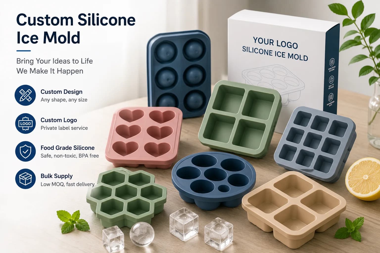
- Packaging carries the story. Instead of over-decorating the tray, buyers can invest in custom packaging, which is a standard customization option for custom silicone ice molds [K1][K5].
Scenario-based advice
A hotel group ordering trays for in-room ice service usually wants a tray that stacks neatly in a mini-fridge and reads clearly in photographs. A distillery running a gift-with-purchase promotion wants the brand mark to be unmistakable on the cube in a glass. A promotional distributor wants a low-risk item that ships in volume. In all three cases, a plain tray with one strong logo outperforms a decorative tray with a weak mark.
For buyers comparing formats across a wider catalog, reviewing the broader range of custom silicone ice molds helps clarify which tray geometries are already proven before requesting a new tool.
3. Embossed vs. Debossed vs. Printed: Getting the Logo Direction Right
Core conclusion: the word "embossed" describes the mold surface, not the ice — and buyers must confirm which direction they want before tooling starts.
This is the most common source of misunderstanding in logo-on-ice projects. In tooling language:
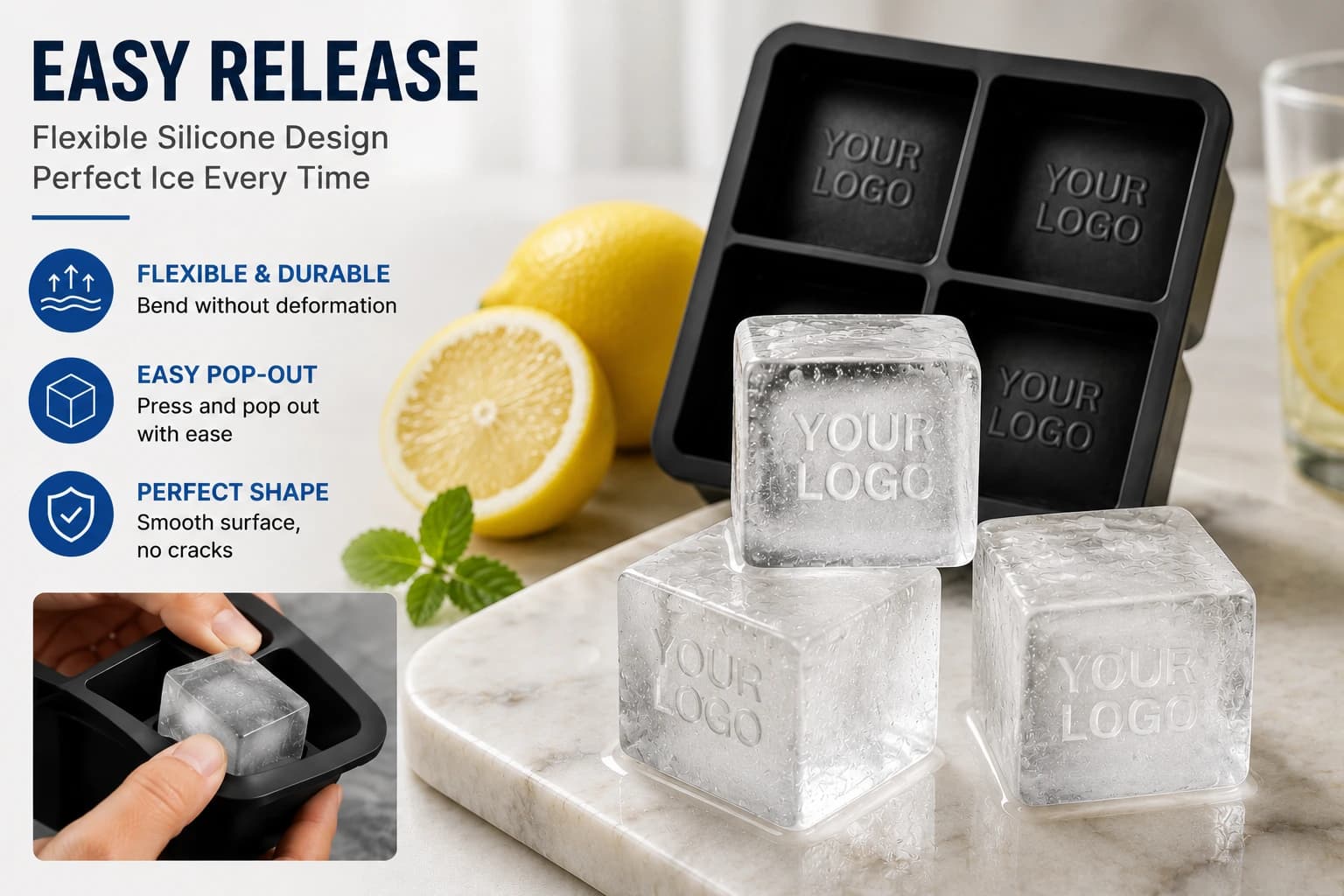
- An embossed logo is raised on the tray surface. Because the raised silicone occupies space inside the cavity, the frozen cube comes out with a recessed logo.
- A debossed (engraved) logo is cut into the tray surface. Water fills the recess, so the cube comes out with a raised logo.
- A printed or applied logo sits on the tray exterior and does not appear on the cube at all.
Terminology varies between suppliers, so the safest approach is to describe the desired result on the ice and ask the supplier to confirm the corresponding tooling treatment in the design review documentation [K2].
| Logo method | Where the mark sits | Result on the ice cube | Typical use case | Main caution |
|---|---|---|---|---|
| Embossed on tray (raised silicone) | Inside cavity wall or base | Recessed mark on the cube | Clean, understated branding; easy to read in clear ice | Confirm stroke depth so the mark does not trap the cube |
| Debossed on tray (engraved) | Cut into cavity wall or base | Raised mark on the cube | Strong contrast under light; good for short words and monograms | Thin strokes can chip or blur at the edges |
| Printed / labeled on tray exterior | Outside surface only | No mark on the cube | Retail shelf differentiation, secondary branding | Not a branding method for the ice itself |
| Logo on packaging only | Packaging | No mark on the cube | Low-cost branding, sampling-friendly | Brand impact ends when the tray is unboxed |
Design rules that hold up in practice
- Keep the mark short. A single word, monogram, or simple symbol reads better on a 30–40 mm cube face than a full tagline.
- Choose bold, geometric letterforms. Fine serifs and hairline strokes lose definition in ice; simple sans-serif shapes and generous stroke weight survive better.
- Respect the demolding direction. A mark placed on the cavity base is usually easier to mold and release than one wrapping around tight corners.
- Use color contrast deliberately. Custom colors are available for silicone products [K5], and a lighter tray with a darker cube — or the reverse — can make the mark more visible in photography.
A useful stress test before approving a sample: freeze a cube, place it in a glass of water, and view it from arm's length. If the mark is not identifiable at that distance, the design will not work in service either.
4. The Development Path: From Design File to Approved Production
Core conclusion: most delays in custom silicone ice cube projects come from incomplete design files and unclear approval criteria, not from manufacturing capability.
A typical project moves through a defined sequence. The details vary by supplier and by market, but the structure is consistent [K1][K2]:
- Brief and concept review. Define tray format (cube, sphere, stick), cavity count, cube size, target markets, and branding intent.
- Design file preparation. Supply artwork for the logo in a usable vector format, plus any packaging artwork. Confirm whether the logo should appear as raised or recessed on the ice.
- Design review and feasibility feedback. The supplier comments on stroke weight, draft angles, wall thickness, and any element likely to cause molding problems.
- Tooling. Molds are prepared for the approved geometry. Changes after this point usually cost more than changes before it.
- Sampling and approval. Physical samples are produced, checked against the approved specification, and signed off. A written checklist reduces the risk of subjective approval.
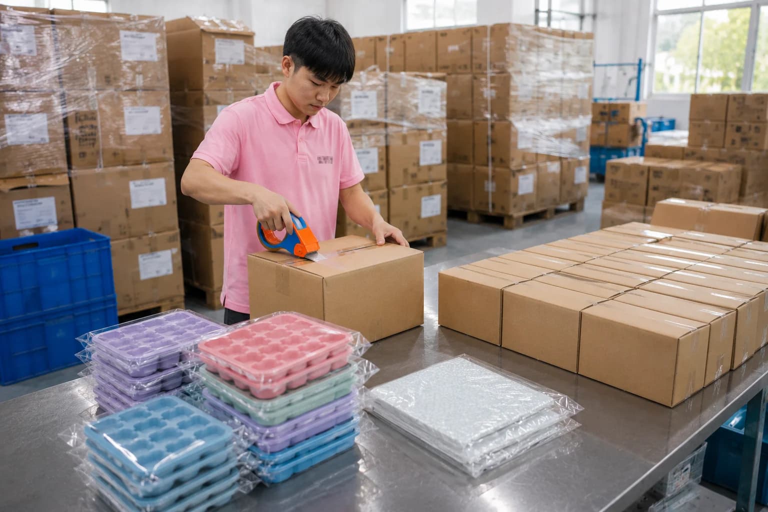
- Production, inspection, and shipping. Pre-shipment inspection confirms logo legibility, color match, cavity consistency, and packaging accuracy [K2].
Where buyers lose time
- Artwork sent as a screenshot or low-resolution image. Logo depth and stroke weight cannot be judged from a raster file.
- Logo direction left ambiguous. A supplier who assumes the opposite direction from the buyer produces a technically correct but commercially wrong sample.
- Approval given verbally. Without a signed sample or photo reference, disputes at inspection stage are difficult to resolve.
- Compliance expectations unstated. Market-specific documentation should be discussed during planning, framed around the requirements of the destination market rather than assumed certification claims [K2].
Buyers running their first project often benefit from a structured conversation about the silicone OEM/ODM development process before committing to tooling, because the sequence above determines most of the cost and timeline.
5. Material, Compliance, and Practical Durability Checks
Core conclusion: the tray must be judged as a food-contact product first and a branding item second.
Renjia's publicly verified product specifications for its silicone lines state: silicone material, food-grade for food contact, odorless, temperature resistance from -40°C to 240°C (-40°F to 464°F), custom sizes available, and customization across colors, sizes, shapes, and packaging [K5]. These are the specifications to verify against the actual quotation and sample for a specific project, since product-specific confirmation is part of the sourcing process [K4].
A practical verification checklist
| Check | What to confirm | Why it matters |
|---|---|---|
| Material grade | Food-contact silicone confirmed for the intended use | The tray contacts drinking water and ice directly |
| Temperature range | Stated range covers freezing and any dishwasher exposure | Prevents deformation or odor issues in service |
| Odor | Odorless at room temperature and after washing | Odor transfer affects taste perception |
| Logo integrity | Mark depth consistent across all cavities | Uneven depth causes inconsistent ice appearance |
| Demolding | Cubes release cleanly without cracking | A too-deep mark can grip the cube |
| Warping | Tray sits flat after repeated freeze cycles | Affects stacking and retail presentation |
| Packaging accuracy | Artwork, language, and barcode correct | Packaging errors block retail acceptance |
Boundary conditions worth stating plainly
Minimal design does not mean no specification. It means fewer variables. Buyers should still expect to discuss MOQ, tooling cost, sampling lead time, and production lead time, all of which depend on the specific mold and order and should be confirmed in the quotation rather than assumed [K2]. Likewise, compliance planning should be based on the destination market's actual requirements — general claims about certification should not be made unless they are documented and verified for the specific product [K2][K4].
For buyers building a broader program beyond ice trays, the same material and inspection logic applies across the silicone household product range, which covers household, baby, pet, kitchen, and promotional categories subject to product-specific verification [K3][K4].
6. FAQ
Q1. Will an embossed logo make the ice cube harder to release from the tray?
It can, if the mark is too deep or has sharp edges. A recessed mark on the cube is created by raised silicone in the cavity; if that raised element is deep and narrow, the frozen cube grips it. The practical fix is to keep the logo shallow and generously radiused at the edges, and to approve a physical sample by actually freezing and demolding cubes rather than judging from a rendering.
Q2. Can I add a logo to a plain tray without changing the tray shape?
In most cases yes. Logo customization is a standard option within custom silicone ice mold projects, alongside cavity design, shape, size, color, and packaging [K1]. Keeping the tray body unchanged and localizing the change to the logo area usually reduces tooling complexity and sampling cycles compared with a full redesign.
Q3. What information should I prepare before requesting a quote?
Prepare the tray format and cavity count, target cube dimensions, desired result on the ice (raised or recessed mark), logo artwork as a vector file, intended color, packaging direction, target market, and expected order quantity. This set of inputs matches the standard customization scope for custom silicone ice molds [K1] and allows MOQ, tooling, and lead-time estimates to be given accurately [K2].
Q4. Is the silicone food-safe and heat resistant?
Renjia's publicly verified specifications state food-grade silicone, odorless material, and temperature resistance from -40°C to 240°C (-40°F to 464°F) [K5]. Buyers should still confirm the specification on the approved sample and quotation for their specific product, and plan market documentation based on the destination market's requirements rather than on general assumptions [K2].
7. Conclusion
A plain silicone ice tray with a single embossed logo is not a compromise — it is a deliberate design decision that reduces tooling risk, keeps the brand mark readable in a glass, and lowers the chance of a failed sample. The three decisions that determine the outcome are: the direction of the mark (raised or recessed on the ice), the weight and simplicity of the letterforms, and the discipline of the approval process.
Recommended next step: write a one-page specification that states the tray format, cavity count, desired ice mark direction, logo artwork file, color, packaging, and target market. Send it for design review before tooling, and request a physical sample that you freeze and demold yourself. Confirm MOQ, tooling, and lead times in writing [K2], and verify material and temperature specifications against the approved sample [K5]. Buyers who follow that sequence typically move from idea to dependable production with fewer revisions — which is the real meaning of "maximum impact" in a minimal design.